
Embracing My Relationship With Y2K in a Major New Project!
- Richard Goodwin-Wilcox

- Apr 29
- 6 min read
Updated: May 5
In brief: I'm reinterpreting the foods I remember were presented at a turn-of-the-millennium birthday party to scrutinise where we have come since and see what we have lost along the way. |


Knocking around in some ill-fitting kitsch clobber, probably snot-nosed, with the latest version of Now playing out of a silver, blob-shaped CD player, I can easily return to my first encounters with Party Rings. This luxury was reserved for birthday parties I attended circa 2003—Y2K. I've always been a perpetrator of nostalgia. I often rock up at my parents’ house to a raised eyebrow from my mother, exclaiming, ‘That jacket wasn't cool when it came out in my 20s, and it's even worse in yours’. Nonetheless, the 00s—maybe because it was the first era I experienced—were so kitsch, so garish, so unashamedly unsubtle, I was certain it would never come back around. I didn't want it to. The 60s to the late 90s have always been a cultural high-water mark for me. Y2K marked its death. The band became the boy band, and pop culture became cynically capitalist and unself-aware. This is why I am so shocked to find myself embracing what feels like a monumental cultural shift—the dawn, or rather redawn, of Y2K. The design of the 00s was amateurish. It was properly cack! At the time, X thousand years of analogue design were giving way to digital. The cultural knowledge of digital design had yet to be established, and hardware limitations compounded the problem. Despite the serious lack of polish, fueled by the optimism of the age, the era was bold. Everything was wow, wow, no punches pulled, slap in the face. Technology helped you escape the real world into a near-future, digital one: Napster, technofuturism, iPod 1st Gen. The future felt bright. Problems would be innovated away. Design became untethered from reality. Then the bankers shit the bed in 07, the dream died. Hope turned to austerity. Optimism to restraint. All the high ideals of futurism came crashing down. We entered an era of austere design. The excess of early digital was replaced by caution. Minimalism took hold. Designers worked to escape the sloppiness of the early days of digital. The past 10–15 years have been all about refining and refining, getting cleaner, polishing everything, so goddamn smooth the edges between things can no longer be seen. It all globbed together, a kind of digital perfectionism, an amorphous blob where all character has been flattened out. As is with every new generation, as they become adults, Gen Z have come along and said, ‘fuck off with your naff, clean, minimal BS’. Getting bent over for and by: housing, social media, the job market, the cost of eggs, politics, war, and the environment. This moment is too trying for young people to accept a culture that to us has become a thin layer of polished enamel on a turd. Y2K re-emerged as a subculture in the late 2010s in the backrooms of the internet. It spread as an aesthetic via Tumblr, then fashion. Picking up cultural weight as music artists harnessed the motif. All this culminates in a global cultural moment in 2024: Brat Summer. It so encapsulated the rejection, not just of an aesthetic, but of the underlying cultural values that manifest as polish and perfection. Y2K is not a continuation; it’s a reconstruction. It reinterprets the aesthetics of the turn of the millennium. It’s dusting off the optimism of an era. A curation of the past as an escape from present pessimism. At its core is a set of throughlines: authenticity over perfection, maximal over minimal, irony over sincerity, self-expression over conformity. In the last 18 months, the rapid emergence of a new technology has acted like gasoline on a fire: AI. If this generation were suspicious of inauthenticity before, they are thoroughly heretical now. AI content, used in earnest, is a cultural ‘ick’. In human history, have we ever turned so quickly against the output of a new technology? I’m looking at my camera, my work, and asking: where’s the personality? Couldn’t this be done by CG, by AI? I might have a perspective, but why do I need a camera to deliver this anymore? My very first memories bookend the original Y2K era. If you put credence in such categories, I was born first of the Gen Zed’s. Like a horoscope, Y2K calls out to me—I was hooked at ‘irony’, and I'm sticking around for authenticity. As a food photographer, I began asking what I remembered visually from that time. I kept coming back to children’s parties: beige spreads, fluorescent sugar, E-numbers—and, of course, Party Rings. This isn’t a one-off; this is an invitation. I’m throwing a party. This series is the first of many in a larger project—each a vignette drawn from that table in 2003. Embracing the camera and its unique ability to capture imperfection - something real. It wields nostalgia, irony, and maximalism to provoke a smile, a laugh, and ask what the fuck happened to that optimistic innocence—and whether there’s any way back to that future. |

Party Rings: When snacks were for fun |
First off, do you know you can still get a pack of these for a quid? Concept Party Rings felt like the obvious entry point. They’re fun, maximally playful, colourful—the first thing gone from the table. Above all, they’re kinda shit, but they totally work. Visual language The palette is the perfect foray into the era: tactless pink, purple, yellow, and orange—the perfect It-girl gradient. It’s so synthetic. But the colours just make you wanna smile. It looks like someone drained the colour out of a bed of spring flowers and threw it at a wall. You’d never dream of making something this inorganic now. Snacks are all muted, “natural”, and four times the price. This is the opposite.  Imperfection One thing I wanted to do with this series was lean into the imperfection. So what if there’s the odd grain of sugar on the surface, if they’re not perfectly round, if the icing has slipped or dripped. That’s character—let it sing. Texture + surface With each shot, I wanted to reveal the glossy texture. That thin layer of dissolved sugar on top of the icing gives you this almost chromed finish as it catches the light—a small nod to futurism. Background + materials The background was one of the first challenges. Normally, I’d build it digitally, but here I wanted to create that glow in-camera. I also wanted the background itself to feel imperfect. I landed on using iridescent, translucent PVC over the lights. The smallest movement would completely change the result. That unpredictability became part of it—working towards a happy accident each time. By the end, I understood the material well enough to nudge it in the right direction without fully controlling it. 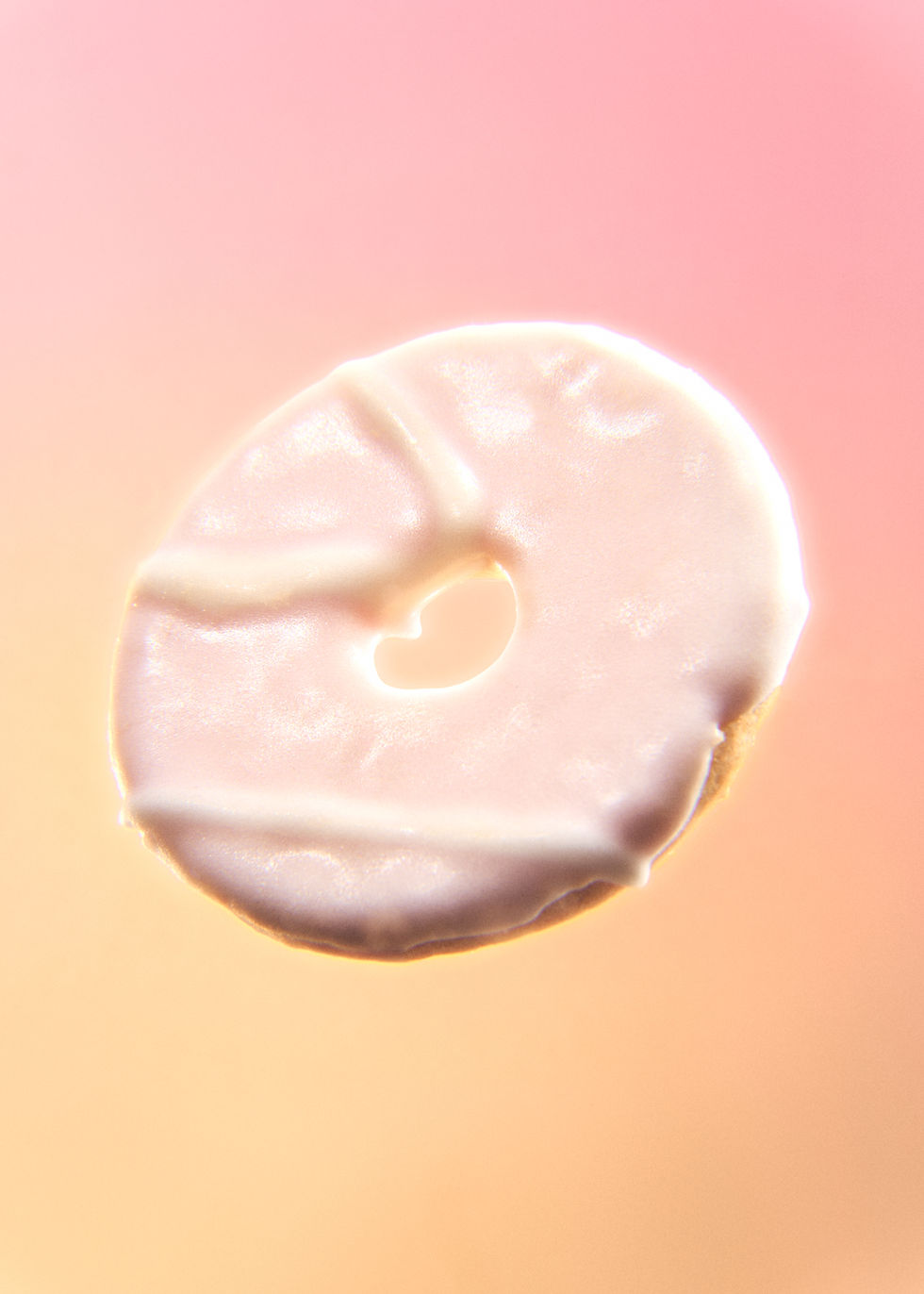 Lighting approach Lighting was key. I wanted these to feel high-key—pulling from poppy Y2K imagery, think Spice Girls posters—then wrapped in this near-continuous glow. The lights sit very close to the subject on both sides to create that enveloping feel. I also used a large beauty dish directly behind the camera to flatten everything out. Normally, that’s a mistake in food photography—it kills your texture. So the recovery was to reintroduce it. A hard light is positioned at just the right angle to catch the sugar and throw highlights across the surface. That’s what brings back the texture and gives that chrome effect. Optical character There’s also a subtle detail in the highlights—chromatic aberration pushing out from the centre of the frame. You don’t really notice it on its own, but it shapes the overall feel. For me, it’s about finding something beautiful in the imperfection. Styling When it comes to styling, the choice of each subject is vital. It has to be perfectly imperfect. I didn’t want the perfect Party Ring—I wanted the one that’s just a bit off. The messy one. With the triangles in particular, nothing quite lines up. They couldn’t, really. The patterns suggest order, but don’t resolve. The lines on the biscuits are all over the place, so the geometry never fully settles.  Retouching Retouching was one of the most counterintuitive parts. It wasn’t about leaving everything as is. I removed things, filled gaps, and shaped the surface. Embracing imperfection isn’t about doing nothing—it’s about deciding what feels right. What adds character, and what just distracts. I went back and forth on whether to keep the exposed biscuit in the yellow shots. In the end, it stayed. It makes them look a bit shit, a bit cheap, a bit mass-produced—which is exactly what they are. Intent I'm interested in taking something with such playful design. That resonates with me from that era. How can it inform our approach to design and imagery today?  |


Comments